This is the first post of two on the algorithms I used for lastwave.
Using d3.js and rickshaw.js, it was really easy to make a bezier curve wave graph. Rickshaw has a built in label system that shows which graph you’re looking at when you hover over it. My first instinct was to modify the built in code to try to get it to place the text based on the curve, but unfortunately that kind of led to a dead end.
Placing Text
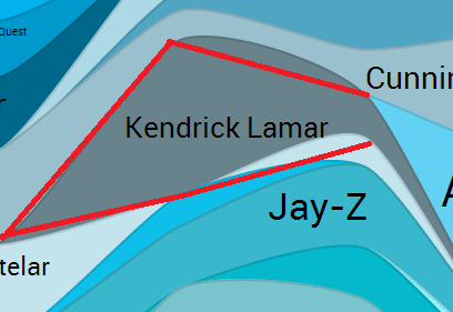
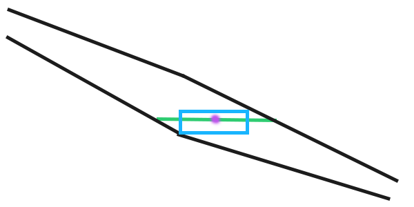
Let me use this image to illustrate what I’m trying to do. Here’s a curve that is part of a graph. This curve is already drawn using rickshaw, but the challenge is now to place text in such a way that the artist’s name fits within the curve.
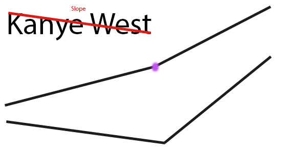
Thinking up a way to solve this problem was pretty difficult and I’m still not sure that I did it the best way. My eventual decision was that the best way to solve this problem was to treat the bezier curves like straight lines, like this:
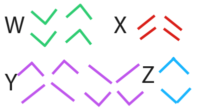
This way, I could use the equations of the lines (y=mx+b) to calculate the best position to place the text, as well as how large to make it. The key revelation was that I would need a different algorithm for each unique situation, based on the slope of the line. There are 4 lines and two different slopes (positive and negative) possible for each line, so 4^2 = 16 possible combinations. Luckily I realized that there were distinct groups that I could treat similarily, and cut it down to four line types, as follows:
Now I just needed four different equations/algorithms to calculate the position of the text.
“W-type”
The key behind this one was that you could turn your bounding area into a triangle by cutting off the outward facing sides and turning the area into a triangle. At that point it was just a matter of placing the text within a triangle which is relatively easy.
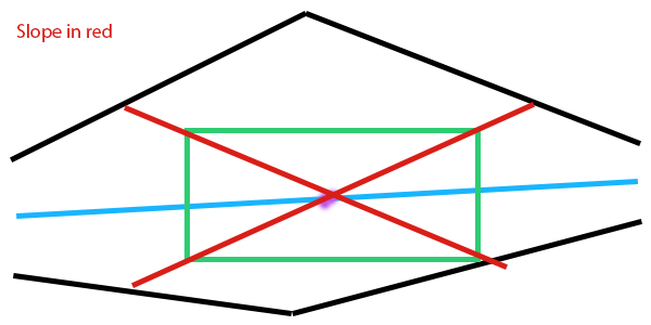
“X-type”
This was one of the more difficult ones to figure out. Depending on how the line is set up, there could possibly be _no_ best place to put the text (if the distance from each line is equal all the way across, the text will be max size at any point).
I finally decided to first find the point on the line that has the maximum horizontal distance from the top bound to the bottom bound, and then draw the text around this line.
“Y-type”
This is the most complex (and cool) algorithm used in the text placement. This is best illustrated with an animated gif:
1. Draw a line from our start point away from that side.
2. Once that line collides with an edge, we pretend that our diagonal line creates a rectangle. Our new start point is vertically opposite to our collision point.
3. Draw a line from our new start point with an opposite slope to our first line. Once again, wait until this line collides with an edge.
4. Create a new start point at the point vertically opposite to this new collision point.
This process is repeated until you end up with a “bounce” which is when this function continues to bounce between 1,2, or 3 of the same points (illustrated below is 1). The bounce point is generally very good at maximizing text size.
“Z-type”
Z-type was the easiest of all of them. To place the text, I simply took a midpoint between the ends of the top and bottom lines, and kept increasing text size until it didn’t fit anymore.
Fudge functions
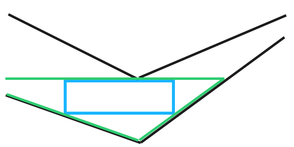
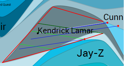
Unfortunately, despite all of these working amazingly well on _straight_ lines, a wave was made up of bezier curves, which only approximate the straight lines to make them look pretty. Sometimes, as shown below, the bezier curve could be very far away from it’s straight line equivalent indeed. Luckily, the movement of the bezier curve can be predicted, so at the end of each text placement algorithm, I was forced to place some “fudge” if statements, for example:
if
             slope of the top left line<0
and          slope of the top left line is greater than the slope of the top right line
and          slope of the bottom left line is greater than the slope of the bottom right line
and          the difference between the bottom left and bottom right line is greater than 0.4
and          the top left line and bottom left line have the same left endpoint
then
             push the text to the right and modify it's y component slightly
not an exact science, but hey, neither is a wave graph. The biggest weakness of LastWave is when text isn’t placed properly, but if I keep adding good fudge functions, I’ll eventually get to a point where it’s near perfect.
Finding the width and height of the text
Since custom fonts can be used in lastwave, I used a function to find what I called the “slope” of the text (bottom left corner to top right corner). It creates a new div with the text in it, checks what the div height vs div width are, and then removes the div while returning that slope value. Pretty cool!
String.prototype.slope = function(font) {
 var f = "24px "+font,
 o = $('<div>' + this + '</div>')
 .css({'position': 'absolute', 'float': 'left', 'white-space': 'nowrap', 'visibility': 'hidden', 'font': f})
 .appendTo($('body')),
 w = o.width();
o.remove();
return f.split("px")[0]/w;
}
To fix:
While developing this, I didn’t use functions to calculate things like points of intersection, but in the future I could cut down a lot of code fluff by creating line/point classes and passing them through collision functions. I’d also, as mentioned above, like to add more fudge functions to tighten up the text placement a bit as there are still sometimes errors that I don’t like.